Multi channel retail can be more profitable than single channel retail when each sales channel is profitable on its own. Although multi channel customers spend around 13% more per order, additional channels also reduce contribution margins and increase operating costs. The most profitable retailers measure channel profitability individually rather than relying on total revenue.
WHAT YOU’LL LEARN

Multi channel retail means selling products through more than one sales channel, such as a Shopify store, Amazon, wholesale partners, retail stores, or marketplaces. Unlike single channel retail, businesses reach customers through multiple buying paths while managing inventory, pricing, and operations across each channel.
| Multi Channel | Single Channel |
| Higher reach | Simpler operations |
| More customer touchpoints | Higher contribution margins |
| Better resilience | Easier inventory planning |
| Greater Complexity | Lower operating costs |
| Multiple revenue sources | Single source of revenue |
The comparison shows why the debate between multi channel vs single channel retail is really a discussion about profitability rather than revenue. Multi channel retail increases reach and resilience, while single channel retail often delivers stronger margins and simpler operations.

The latest profitability data shows that multi channel retail becomes more profitable only when every channel supports overall profitability rather than simply adding revenue.
Three findings hold up consistently across recent retail research and operator data.
Shoppers who engage with a brand across multiple channels show roughly a 13% AOV premium over single channel buyers, along with higher retention. Part of this is causal (more touchpoints deepen the relationship) and part is selection (your most committed customers naturally seek you out everywhere). Either way, the customers exist and they are worth more.
A brand earning 100% of revenue from a Shopify store funded by Meta ads has a single point of failure: one algorithm change, one CPM spike, one account suspension. A second channel with independent demand, Amazon’s search volume, a wholesale account’s purchase orders, is insurance that pays out precisely when the primary channel wobbles.
Customers who first encounter a brand on Amazon or in a retail store and later buy direct are among the highest LTV cohorts many brands have, the marketplace or shelf did the acquisition work, and the DTC relationship captures the margin. Brands that track this cross-channel journey often find their ‘expensive’ channel is quietly feeding their profitable one.
The profitability data tells a different story. While additional channels increase revenue, they often reduce contribution margins and increase operating costs.
| Channel (same SKU) | Typical Contribution Margin (CM3) | What Eats It |
| Shopify DTC | 20–32% | CAC / ad spend |
| Amazon FBA | 8–20% | 15% referral + FBA fees + PPC |
| Wholesale | 8–15% | 50%+ off retail price to the buyer |
| Own retail/pop-up | Varies | Rent, staff, inventory risk |
Sources: Eightx – Average Ecommerce Contribution Margin: Amazon vs Shopify by Vertical, 2026
The table shows that more sales channels do not automatically create more profit. As channels expand, contribution margins generally decrease while operating complexity increases.
Although Amazon and wholesale channels often increase total revenue, they usually generate lower contribution margins than direct to consumer sales. Businesses should compare profit by channel rather than total sales when evaluating expansion.
Most businesses estimate the additional revenue from a new sales channel but underestimate the operational costs that come with it. These hidden expenses often determine whether expansion increases profit or reduces it.
Two channels means two demand forecasts, two safety stocks, and stock sitting in the wrong place at the wrong time. Brands routinely discover their stockout rate rises after channel expansion, not because demand outran supply, but because supply was split badly. The working capital requirement grows faster than revenue does.
Each channel reports in its own format, its own attribution logic, its own fee structure. Answering ‘what was our real profit last month?’ goes from a one-source question to a data integration project. Many multi channel brands effectively fly blind on per-channel profitability for years, managing a blended number that hides one channel subsidising another.
A wholesale partner discounting your product on their site undercuts your DTC price integrity. Amazon’s algorithm punishing your listing when your own store runs a sale. Retail buyers demanding margin support. Every added channel constrains pricing freedom in the others, a cost that compounds quietly.
The data points to four conditions. Brands meeting all four consistently profit from expansion; brands missing two or more consistently regret the timing.
Before adding another sales channel, businesses should evaluate whether they are operationally and financially ready. The following checklist summarizes the four conditions most profitable multi channel retailers share.
The most successful pattern in the 2026 data is not ‘multi channel from day one’, it is profitable single channel first, then deliberate expansion. Use the marketplace for discovery volume, wholesale for baseline cash flow, and DTC for margin and relationship, with each channel assigned a job, a margin floor, and its own P&L; line. Multi channel works as a portfolio with roles, not as a revenue scavenger hunt.
The single most damaging habit in multi channel retail is managing blended profitability. A blended 18% margin can hide a 30% DTC business subsidising a −4% marketplace operation. Until each channel carries its own P&L; with fees, allocated inventory costs, and channel specific marketing loaded, you cannot know whether expansion helped or hurt. Many brands discover the answer years later.
There is no universal winner in the debate between multi channel vs single channel retail. Single channel businesses often achieve higher margins with lower complexity, while multi channel retailers gain additional reach, resilience, and customer acquisition opportunities. The most profitable businesses are those that measure each sales channel independently and expand only when every new channel contributes to long term profitability.
Know What Each Sales Channel Really Contributes
Multi channel retail is only profitable when you can measure each channel separately. DataAnalyticsStack builds multi-channel retail dashboards that track revenue, contribution margins, fees, and marketing costs by channel, so you always know which channels drive profitable growth.
Contact us today to see how better reporting can help you make smarter, more profitable retail decisions.

Customer acquisition cost (CAC) is calculated by dividing your total sales and marketing expenses by the number of new customers acquired during the same period. This calculation shows how much it costs your business to gain one new customer and helps you measure the efficiency of your marketing efforts.
It is the single most important number in your growth model. It determines how aggressively you can scale, which channels are worth investing in, and whether your growth is building value or consuming it. Most Shopify founders know their CAC as a rough number. Very few have actually calculated it correctly.
The typical mistake is dividing ad spend on one channel by the new customers acquired from that channel. That gives you a channel CAC that misses 30–50% of the real cost. A more honest calculation includes every dollar spent to acquire a customer, including creative production, agency fees, tools, and marketing software, divided by every new customer acquired across all channels.
In 2026, e-commerce CAC has risen 60% over five years. The average blended CAC for Shopify stores sits between $68–$84, with significant variation by vertical. Understanding your real number is the foundation for every growth decision that follows.
WHAT YOU’LL LEARN

Customer acquisition cost (CAC) is the total amount you spend to win one new customer, ad spend, agency fees, discounts, software costs and influencers’ fees, divided by the number of new customers you gained in that period. Spend $10,000 and get 200 new customers and your CAC is $50.
CAC is important because it shows whether your growth is actually profitable. If a customer costs $50 to acquire but only spends $40, you’re losing money on every scale. As long as customers are worth more than they cost to get, your marketing is healthy.

You can calculate Customer Acquisition Cost (CAC) on Shopify by using a simple formula:
Customer Acquisition Cost = Total Sales and Marketing Costs ÷ Number of New Customers
It is one of the most important marketing metrics because it shows how efficiently your sales and marketing efforts turn prospects into paying customers.
Review your CAC regularly to understand how well your marketing budget is performing. A lower CAC means your customer acquisition strategy is more efficient, especially when customers generate more revenue than it costs to acquire them.
Founders most commonly calculate CAC as: ad spend on a single platform ÷ orders from that platform.
This version is wrong in three ways.
CAC varies enormously by product category, primarily because of differences in average order value, purchase frequency, and how competitive each category is on paid channels.
These are two different tools that answer different questions. Using them interchangeably leads to bad decisions.
Total marketing spend ÷ total new customers. This is your headline number, the one that drives business level decisions. If your blended CAC is $95 and your LTV is $240, your unit economics are workable. If blended CAC is $95 and LTV is $110, you have a structural problem to solve before you scale.
Spend on one channel ÷ new customers acquired from that channel. This tells you which channels are efficient and which are burning budget. A blended CAC of $85 can hide a Meta CAC of $140 and a Google CAC of $55, the blend looks fine, but one channel is destroying value while another subsidises it. You need channel-level visibility to find those leaks.
Here are the 4 metrics to use with customer acquisition cost:
LTV measures the total revenue or profit a customer generates throughout their relationship with your business. Comparing LTV with CAC helps you understand long term profitability. A healthy LTV:CAC ratio is around 3:1, meaning customers generate three times more value than they cost to acquire.
ROAS measures how much revenue you earn for every dollar spent on advertising. It helps you evaluate whether your ad campaign is generating enough sales to justify your CAC. Higher ROAS usually means more efficient marketing.
Gross margin shows the percentage of revenue left after subtracting the direct cost of producing or delivering your products. A strong gross margin gives you more room to spend on customer acquisition while remaining profitable.
Sales efficiency measures how effectively your sales and marketing efforts turn spending into new revenue. It helps you understand whether your customer acquisition strategy is delivering sustainable growth and where improvements are needed.
High CAC usually comes down to 3 culprits: cart abandonment silently inflating your effective Cost per customer, creative fatigue pushing your cost per click up week after week and seasonal buyer making your blended CAC look better than it really is.
Here is how each one works and how to fix it:
The Baymard Institute puts average e-commerce cart abandonment at 70%. If 1,000 people add to the cart and 701 don’t buy, your ad spend acquired all 1,000 visitors, but only 299 converted. Your CAC is calculated against the 299, which means each of those 701 abandonments raises your effective acquisition cost.
A cart recovery email and SMS sequence that recovers just 15% of abandonments gives you 15% more customers from the same ad budget with zero additional spend.
Meta ads typically show declining performance after 14–21 days of continuous serving. When click-through rates drop, cost-per-click rises, and CAC rises with it, but gradually enough that it is easy to attribute it to other causes. Auditing creative performance dates and refreshing any ad set running on creatives older than 30 days often reveals significant CAC efficiency gains.
Gifting categories (candles, homeware, food gifts) typically acquire a surge of customers in Q4 at low CAC because purchase intent is naturally high. Blended annual CAC looks excellent. But 80–85% of those customers never return post-holiday. The real CAC for acquiring a recurring customer is often 3–5x the blended annual figure. Seasonal acquisition and recurring acquisition need to be calculated separately.
Customer acquisition cost is not a single number; it is a system of numbers that tells different stories at different levels of granularity. Your blended CAC tells you whether your growth model is financially sustainable. Your channel specific CAC tells you where to reallocate budget.
Your cohort CAC tells you whether the customers you are acquiring are the kind that generate long-term value. Most Shopify founders only have the first number, and even that one is usually undercounted. Getting all three in view is one of the most impactful analytical steps a growing brand can take.
Know Your True Acquisition Cost, Across Every Channel
DataAnalyticsStack builds Marketing Analytics dashboards that calculate your true blended CAC, show channel level efficiency, and compare your LTV:CAC ratio in one place, so acquisition decisions are based on real numbers, not estimates.
Your Meta Ads ROAS is lying to you because Meta takes credit for sales it didn’t actually cause, sales that came from Google, email or customers who would have bought anyway. That’s why the number on your dashboard is usually 30-100% higher than what your store really earned. Instead of trusting it, look at blended ROAS (total store revenue ÷ total ad spend) and MER, two simple metrics that show you return, with no room for inflation.
If you’ve ever increased your Meta ad spend, watched the platform’s reported ROAS hold steady or improve, and then noticed your Shopify revenue barely moved, you’ve experienced the problem firsthand. Meta said it was working. Your bank account disagreed.
This is not a technical glitch. It is how Meta’s attribution system is designed to work, and it systematically flatters Meta’s contribution to your revenue. Every platform does this. Meta is just the platform most DTC brands have built their growth strategies around, which makes the distortion most consequential there.
Understanding exactly why Meta’s ROAS is overstated, and what to measure instead, is one of the highest leverage analytical changes a Shopify founder can make.
WHAT YOU’LL LEARN

ROAS (Return on Ad Spend) in Meta Ads shows how much revenue you earn for every dollar you spend on advertising. It helps you measure whether your Facebook and Instagram ads are making a profit.
For example, if you spend $100 on meta ads and generate $500 in sales, your ROAS is 5.0x. This means you earned $5 for very $1 spent on ads.
A good ROAS for Meta Ads depends on your industry, products and profit margins. In general, a ROAS between 2.5x and 4.0x for meta ads is considered good for many businesses. This means you earn $2-$4 in revenue for every $1 spent on Facebook and Instagram ads.
Businesses with high profit margins may succeed with a lower ROAS, while those with lower margins may need a higher ROAS to stay profitable.
If your campaigns consistently achieve a ROAS above your break even point, your ads are delivering positive returns. Regularly testing new audiences, improving ad creatives and optimizing landing pages can help increase your Meta Ads ROAS over time.

Meta ROAS looks better than it really is for three reasons: attribution window overcounting, view through attributions and the iOS tracking gap. Together, these three inflate your reported ROS well above your actual return. Let’s break each one down:
Meta’s standard attribution window is a 7-day click and a 1-day view. This means if someone clicks your ad on Monday and buys on the following Sunday, even after also seeing a Google Shopping ad, opening an email, and visiting your site directly, Meta claims credit for that sale. At the same time, Google claims it too. The same revenue gets counted in both dashboards.
For DTC brands running Meta, Google, and email simultaneously, this overlap inflates total attributed revenue by an estimated 30–100% compared to actual Shopify revenue. Add up what Meta and Google each claim and you will typically get a number 40–60% higher than what Shopify actually recorded.
Meta counts a sale as Meta-attributed if someone saw your ad (even for one second, even without clicking) and then purchased within 1 day. This is view through attribution. A customer who scrolled past your ad, forgot about it, and then Googled your brand to buy is counted as a Meta conversion. This inflates Meta’s numbers in a way that is invisible unless you run holdout tests.
iOS 14.5’s App Tracking Transparency reduced Meta’s ability to track conversions from iPhone users, who represent roughly 55–60% of US smartphone users. With only about 25% of iOS users opting into tracking, Meta under reports conversions. To compensate, Meta’s algorithm uses modelled conversions, statistical estimates of conversions it couldn’t directly observe. These modelled numbers are included in your reported ROAS, but they are estimates, not verified purchases.
The solution is not a better attribution tool. Attribution, figuring out which ad caused which purchase, is a genuinely hard problem, and no tool solves it completely. The solution is a better metric that doesn’t require per channel attribution at all.
Blended ROAS is total Shopify revenue divided by total paid ad spend across all channels for the same period. No platform’s attribution model is involved. No overlap is possible. The formula is simple: if you spent $140,000 on ads this month and your Shopify store generated $490,000 in revenue, your blended ROAS is 3.5x.
MER goes one step further than blended ROAS. It divides total revenue by total marketing spend, including agency fees, creative production costs, and influencer payments in addition to media spend. A brand with a blended ROAS of 4.0x but $40,000 per month in agency and creative costs might have an MER of 2.8x. MER is what the P&L actually sees.
The relationship: blended ROAS is the daily operational metric. MER is the monthly P&L metric. Use blended ROAS to make fast spending decisions. Use MER to make budget planning decisions.
To make spend decisions without trusting platform ROAS, do four things: set a blended ROAS floor, track it weekly, keep platform ROAS for within channel comparisons only and test Meta’s real impact with quarterly holdout tests. Here’s how each step works:
Calculate your break even blended ROAS (1 ÷ gross margin). Set your minimum blended ROAS target above that floor by enough to cover fixed costs and generate net profit. For a brand with 55% gross margin and high fixed costs, that minimum might be 3.0–3.5x blended.
Every week: total Shopify revenue divided by total ad spend. Record it. If blended ROAS is stable or improving, your marketing system is healthy. If it’s declining, investigate, not by looking at platform ROAS, but by asking what changed in overall spend mix and creative performance.
Platform ROAS is useful for comparing Campaign A vs Campaign B on Meta, or keyword group X vs keyword group Y on Google. It is not useful for deciding how much to spend on Meta vs Google, because both numbers are inflated in ways that make cross-platform comparison meaningless.
The only real way to know how much revenue Meta drives incrementally, versus revenue you would have generated anyway, is to run a geo holdout test. Pause Meta spend in a test region for 2–3 weeks. Compare revenue change. The percentage decline in the test region gives you Meta’s true incremental contribution. This number is almost always lower than the platform ROAS suggests.
Meta’s ROAS dashboard is not the enemy. It is useful for the job it is designed for: optimising campaigns within Meta’s ecosystem. The problem is using it as evidence that your marketing is working overall. Blended ROAS does that job, and it does it without any of the attribution inflation that makes platform reporting unreliable.
If you are making budget decisions based on Meta’s reported ROAS alone, you are flying with an instrument that reads consistently higher than actual altitude. The blended number is what corresponds to whether the plane is going up or down.
See Your Marketing Efficiency, Not Just What Meta Reports
DataAnalyticsStack builds Marketing Analytics dashboards that show your blended ROAS, CAC by channel, and true spend to revenue efficiency, so you can make budget decisions based on what your business actually generates, not what each platform claims.
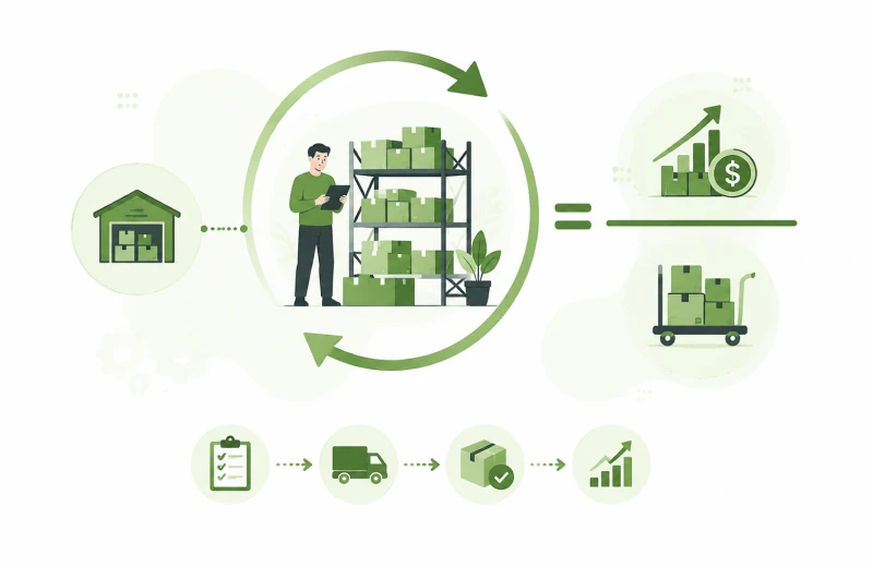
Inventory turnover is more than an inventory metric. It shows how quickly your business turns stock into sales and cash. When products sit in your warehouse for too long, they tie up working capital, increase storage costs, and limit your ability to invest in growth.
Many Shopify brands focus on sales but overlook how fast inventory moves. Even profitable businesses can face cash flow problems if too much money stays locked in unsold stock. Tracking your inventory turnover helps you spot slow moving products, improve purchasing decisions, and free up cash for marketing, new products, or expansion.
In this guide, you’ll learn what inventory turnover ratio is, how to calculate it, what a good benchmark looks like for your industry, and practical ways to improve it without increasing stockout risk.
WHAT YOU’LL LEARN

Inventory turnover ratio shows how quickly your business sells and replaces its inventory over a set period, usually one year. A higher ratio means products sell faster and cash returns to your business sooner.
INVENTORY TURNOVER FORMULA
Use COGS rather than revenue in the calculation. Revenue includes your markup, which inflates the ratio and makes it incomparable across brands with different pricing strategies.

Inventory turnover benchmarks vary by industry. A food brand needs much higher turnover than a home goods business because products move at different speeds. Compare your ratio with businesses in your own category instead of using one benchmark for every ecommerce store.
| Vertical Typical | Range Strong | Performance | Context |
| Food & Beverage | 12–15x | 15x+ | Perishability enforces discipline |
| Supplements & Health | 8–12x | 12x+ | Replenishment drives consistent velocity |
| Pet Products | 8–10x | 10x+ | Subscribe and save pushes turnover up |
| Beauty & Skincare | 4–9x | 9x+ | Broad SKU ranges slow averages |
| Apparel & Fashion | 4–7x | 7x+ | Seasonality creates natural cycles |
| Home Goods | 3–5x | 5x+ | Longer purchase cycles; lower frequency |
| Electronics | 4–6x | 6x+ | Margin offsets slower turns |
| General ecommerce | 4–8x | 8x+ | Wide range by sub category |
Source: Eightx 2026 eCommerce Inventory Turnover Benchmarks.
This is the connection most inventory guides skip. Every unit sitting in your warehouse represents cash that was spent to acquire or produce it, cash that is now locked until that unit sells. The longer inventory sits, the more your working capital is tied up, the less you have available for ads, salaries, and growth.
Here is what the cash flow math looks like concretely:
| Turnover Ratio | Avg Days on Hand | Inventory $ (on $500k COGS) | Cash Freed vs 4x Baseline |
| 4x (baseline) | 91 days | $125,000 | — |
| 6x | 61 days | $83,333 + | $41,667 |
| 8x | 46 days | $62,500 | +$62,500 |
| 10x | 37 days | $50,000 | +$75,000 |
Moving from 4x to 8x turnover on $500,000 in annual COGS frees $62,500 in working capital. For most growing Shopify brands, that is equivalent to 2–3 months of marketing budget. It also reduces storage costs, shrinkage risk, and the probability of carrying obsolete stock.
Inventory turnover is one component of the Cash Conversion Cycle (CCC), the number of days between paying for inventory and receiving payment from customers. A brand with 91 days on hand, net 30 supplier terms, and instant Shopify payments has a CCC of roughly 61 days. Moving to 46 days on hand cuts that CCC to 16 days. Every day you shorten the cycle is a day your capital is working instead of waiting.
Many businesses order too much because they forecast inventory across the whole catalogue instead of looking at each SKU. Track demand for every product individually to make more accurate purchasing decisions. A weighted 90 day rolling average of daily sales per SKU, adjusted for known seasonality, is significantly more accurate than annual revenue projections.
Most brands place large monthly or quarterly purchase orders because it feels like a supply chain efficiency. For many SKUs, the opposite is true: smaller orders more frequently reduce average inventory held while maintaining service levels. Smaller orders may cost a little more per unit. However, they also reduce the amount of cash tied up in inventory. In many cases, the extra flexibility is worth the added cost. Calculate whether the working capital freed is worth the incremental per unit cost.
ABC analysis often shows that most revenue comes from a small number of products. Slow moving items take up warehouse space and lock up cash without adding much value. These C category products often sit in the warehouse for months. They tie up cash and reduce your overall inventory turnover. A targeted markdown strategy, bundle inclusion, or discontinuation plan for C category products sitting over 90 days without sales acceleration is the fastest way to improve overall turnover metrics.
High inventory turnover is usually a good sign. However, it can become a problem if products keep selling out before you can restock them. A supplement brand turning inventory 20x per year with a 4% stockout rate is not running lean; it is losing sales constantly to stockouts. The target is the highest turnover achievable while keeping stockout rates below 2% for A category products.
Inventory turnover is one of the most direct connections between operational decisions and financial health. Every order you place and every product you keep on the shelf is a capital allocation decision. A brand that turns inventory eight times a year instead of four keeps much less cash tied up in stock. That extra cash can support marketing, product development, and future growth. Understanding your current ratio, benchmarking it against your vertical, and identifying which SKUs are dragging it down is one of the clearest paths to improving cash flow without growing revenue
Know which products sell quickly, which tie up your cash, and when it’s time to reorder. DataAnalyticsStack helps Shopify brands track inventory turnover, days on hand, and sell through rates in one easy dashboard.
Contact us today to see how better inventory insights can improve your cash flow.
In 2026, the average ecommerce ROAS benchmark across all platforms is 2.87x, down roughly 4% year over year, driven by rising CPMs, iOS attribution gaps, and increased auction competition.
There are a few numbers in DTC that generate more misplaced confidence than ROAS. A founder sees a 4.2x on their Meta dashboard, feels good, keeps spending, and six months later wonders why the bank balance hasn’t moved with revenue. ROAS is real. But the version most founders are looking at is not the one that predicts profitability.
That headline number hides enormous variation across platforms, verticals, and business models. A skincare brand with 65% gross margins can scale profitably at 2x ROAS. A fashion brand with 40% margins might need 5x just to cover costs.
This article gives you the actual 2026 benchmarks, by platform and by category and explains the more important question underneath them: what ROAS number makes your specific business profitable.
WHAT YOU’LL LEARN
✓ What is ROAS?
✓ What is good ROAS?
✓ How to calculate ROAS?
✓ 2026 ROAS Benchmarks by Platform
✓ 2026 ROAS Benchmarks by Industry
✓ Why Your Meta ROAS May Not Match Reality
✓ How to Calculate Your Break Even ROAS

ROAS stands for Return on Ad Spend. It measures how much revenue your business earns for every dollar spent on advertising. Businesses use this metric to understand how effectively their ads are driving sales.

A good ROAS depends on your business, not only the number on your ad dashboard. For many DTC ecommerce brands, a ROAS between 3x and 5x is considered healthy because it may leave enough revenue to cover product costs, marketing and other operating expenses. However, there is no universal target that works for every store.
For example, a skincare brand with high profit margins may still grow profitably with a 2.5x ROAS, while an electronics store with lower margins might need 4x or higher just to break even. Instead of chasing the highest ROAS, focus on the one that keeps your business profitable after all costs are included.
ROAS is a marketing efficiency metric. It tells you whether your ads are generating revenue. It does not tell you whether that revenue is worth generating.
The formula is simple:
ROAS = Revenue Generated from Ads ÷ Advertising Cost
For example, if you spend $500 on ads and generate $2,000 in sales, your ROAS is 4x. That means every dollar your spent on advertising brings back four dollars in revenue.
A high ROAS does not always mean your business is profitable. It only measures the relationship between advertising costs and revenue. It does not account for product costs, shipping, payment processing fees, returns, salaries or other operating expenses.
That is why two businesses with the same ROAS can end up with completely different profits. Your margins, operating costs and pricing strategy all play an important role in determining whether your advertising is actually making money.
Platform matters more than most benchmarks acknowledge. Google captures demand that already exists, people actively searching to buy. Meta creates demand by interrupting people who weren’t looking. That structural difference shows up directly in the numbers.
This category is a stronger predictor of ROAS than platform. High margin categories with strong visual appeal and frequent repurchase cycles consistently outperform the average. Low margin categories with complex buying decisions consistently underperform it.
This is the uncomfortable truth about platform ROAS: every platform, Meta, Google, TikTok, reports ROAS using its own attribution model. Each one claims credit for conversions where it played any role. When a customer sees a Meta ad, then searches on Google and then buys via an email link, all three platforms may claim the same sale.
A real example from a DTC apparel brand: Meta reported 4.2x ROAS. Google reported 6.1x. When total Shopify revenue was divided by total ad spend across both channels, the blended ROAS, the real number was 2.65x. That gap is not an error. It is attribution overlap, view through counting, and platform-optimistic reporting built into every dashboard.
Blended ROAS is total revenue divided by total ad spend across all channels, no attribution model, no platform bias, no double counting. It is the only ROAS figure that reflects how your marketing system actually performed.
If your Meta ROAS looks healthy but your blended ROAS is declining month over month, your overall marketing system is becoming less efficient, even if individual campaigns look strong. The blended number is what shows up in your bank account.
Your break-even ROAS is the minimum return needed to cover your product costs. Below this number, every ad dollar spent generates a loss at the product economics level, before any fixed costs are counted.
A simple way to estimate it is:
Break even ROAS = 1 ÷ Gross Margin
For example, if your gross margin is 50%, your break even ROAS is 2x. However, once you include shipping, payment processing, returns and other variable costs, many businesses actually need a ROAS closer to 3x before they become profitable.
ROAS is a useful metric, but only when you know which ROAS you’re looking at and what it means for your specific margin structure. A 4x Meta ROAS reported on a 30% gross margin business is not a success story.
A 2.5x blended ROAS on a 65% gross margin business might be excellent. The number that matters is the one you can compare directly against your cost structure and that number is always blended ROAS measured against your break even threshold, not against a generic industry average.
DataAnalyticsStack builds Marketing Analytics dashboards that show ROAS, CAC, and channel performance across all your paid channels in one place, so you always know your real marketing efficiency, not just the number each platform wants you to see.
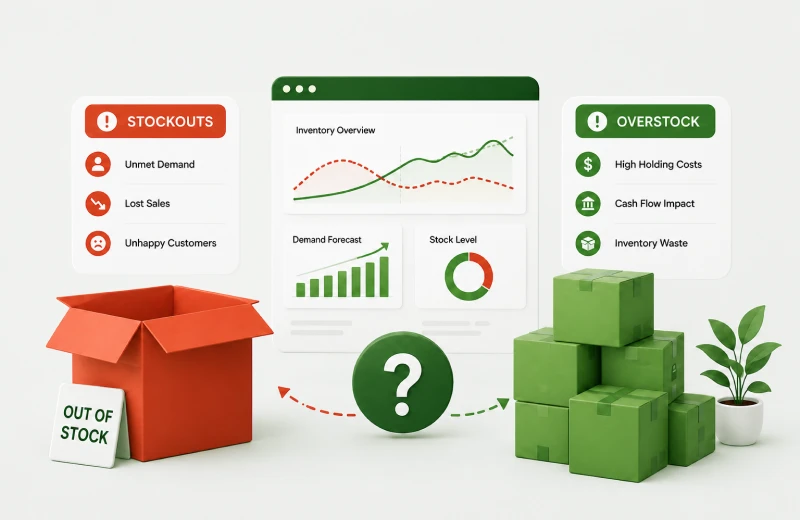
Every growing Shopify store faces the same challenge. Order too little and you lose sales. Order too much and cash gets tied up in products that sit on the shelf. Finding the right balance is one of the hardest parts of running an ecommerce business.
According to IHL Group, poor inventory management costs retailers $1.7 trillion every year through lost sales, excess stock, and unnecessary storage costs. For many Shopify businesses generating $500,000 to $2 million in annual revenue, preventable overstock alone can lock up $30,000–$150,000 in working capital. That is money that could otherwise support marketing, new products, or business growth.
The good news is that you do not need complicated forecasting models to improve your inventory decisions. With the right data and a few simple calculations, you can reduce stockouts, avoid over ordering, and keep more cash available for your business.
Better inventory decisions do more than reduce stock problems. They improve cash flow, increase customer satisfaction, and give your business more flexibility to grow.
It starts with understanding why inventory problems happen in the first place.
WHAT YOU’LL LEARN

Stockouts and overstock rarely happen by accident. In most cases, they come from a few common mistakes in the way inventory is planned and managed.
Many stores plan inventory based on sales revenue instead of units sold. That creates problems because revenue changes when prices change. Inventory planning works best when you forecast the number of products customers actually buy.
A fast moving product with a 3-day supplier lead time needs a very different safety stock than a slow mover with a 45-day lead time. Applying the same reorder logic across your catalogue guarantees you will be overstocked on slow movers and understocked on fast ones.
Customer demand changes from week to week. Sales often increase during promotions, holidays, or seasonal events. A product averaging 15 units per day might range from 8 to 40 depending on day of week, promotions, and seasonality. Safety stock needs to account for that range, not just the mean.
Not every stockout has the same impact. Running out of your best selling product can cost thousands in lost sales, while running out of a slow moving item may have very little effect. Focus your inventory investment where it matters most.
A reorder point tells you exactly when to place your next order. Instead of guessing, you use your sales data and supplier lead time to calculate the right moment.
REORDER POINT FORMULA
Reorder Point = (Average Daily Sales × Lead Time in Days) + Safety Stock
Safety Stock = 1.65 × Standard Deviation of Daily Sales × √(Lead Time)
(1.65 = z-score for 95% service level, i.e. 95% chance of no stockout)
Example:
This simple calculation helps you place orders before stock runs low instead of reacting after you’ve already lost sales.
Don’t worry if the formula looks technical. Most inventory software or even a simple spreadsheet can calculate it automatically once you enter your sales data.

Stockouts usually leave warning signs before they happen. Watching these signals helps you react early and avoid lost sales.
A sudden increase in sales is often the first warning that demand has changed. For example, if a product normally sells 12 units a day but suddenly starts selling 22, your existing reorder point may no longer be enough. That increase is often an early warning that demand has changed.
A simple way to measure this is:
If this number drops below your lead time plus safety buffer, you are at stockout risk. Review this weekly for your top 20 SKUs by revenue.
Promotions, influencer campaigns, holidays, and seasonal events can increase sales much faster than normal. Planning inventory before these events helps you avoid unexpected stockouts.
If your supplier extends their lead time from 21 days to 35 days, even temporarily, your existing reorder points are wrong. Maintain a lead time log per supplier and update reorder calculations whenever lead times change.
Not every product deserves the same amount of inventory. ABC analysis helps you identify which products generate the most revenue and which ones quietly tie up your cash.
| Category | % of Revenue | % of SKUs | Inventory Priority |
| A — Core performers | 70–80% | 10–20% | Never run out. Heavy safety stock. |
| B — Secondary movers | 15–20% | 20–30% | Maintain standard reorder logic. |
| C — Slow movers | 5–10% | 50–70% | Reduce safety stock. Review quarterly. |
C category products sitting in your warehouse for more than 90 days with no meaningful sales velocity should be reviewed for markdown, bundle inclusion, or discontinuation. The cash tied up in C category overstock is almost always worth more deployed into A category safety stock or marketing spend.
THE OVERSTOCK CASH TRAP
A Shopify brand doing $800k/year carries an average of $120k in inventory at any given time. If 40% of that is C category stock turning fewer than twice per year, $48k in working capital is effectively frozen. That is marketing budget that cannot be spent, stock that cannot be discounted without margin damage, and warehouse space that is not generating returns.
Numbers tell the real story behind your inventory. If you skip these metrics, you run your store on guesswork. Track them instead, and you spot problems before they cost you sales.
Here are the metrics that matter most:
This shows how many times you sell and replace your stock in a set period. A higher number means your products move fast.
This tells you what percent of your stock you sell within a certain time. It helps you spot slow movers early.
This shows how many days your current stock will last at your normal sales pace. Low numbers warn you to reorder soon.
This tracks how often you run out of a product. A high rate means lost sales and frustrated customers.
This shows how much profit you earn for every dollar you spend on inventory. It tells you which products actually pay off.
Track these five metrics, and you get a clear picture of your store’s health. You’ll know what to restock, what to discount, and what to drop altogether.
Small improvements made consistently often have a much bigger impact than trying to predict every change in demand. You want enough stock to meet customer demand without filling your warehouse with products that do not sell. By reviewing sales data regularly, updating reorder points, and tracking slow moving products, you can reduce stockouts, improve cash flow, and make smarter purchasing decisions as your business grows.
See which products are slowing down your inventory turnover, tying up cash, and reducing profitability. DataAnalyticsStack helps Shopify brands track inventory turnover, days on hand, sell through rates, and SKU performance in one easy dashboard.
Contact us today to see how better inventory insights can improve your cash flow.
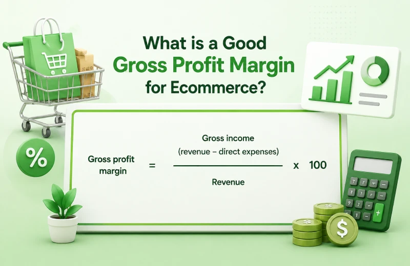
A good gross profit margin for eCommerce is 50%–70%. This range gives businesses enough room to cover operating costs and invest in growth, while margins above 70% are considered excellent.
Ask ten Shopify founders what their margin is and most of them will quote you their gross margin. Ask them their net margin and most will give you a long pause. The gap between those two numbers is where most DTC brands silently lose their profit, and chasing the wrong benchmark is one of the fastest ways to scale.
This article will guide you on what a good gross profit margin is for ecommerce, how to calculate it, and give you the floor your business needs before you start scaling ad spend.
WHAT YOU’LL LEARN
✓ What is gross margin?
✓ How to calculate gross margin?
✓ Good gross margin for ecommerce
✓ 2026 gross margin benchmarks by ecommerce vertical
✓Why gross margin is not the same as profitability
✓ What a healthy contribution margin looks like

Gross margin is the percentage of money your business keeps after paying the direct costs of making or buying the products you sell. These costs usually include things like raw materials, manufacturing or wholesale purchase costs.
It does not include other business expenses such as rent, marketing, salaries or software subscriptions. A higher gross margin means you have more money left to cover those costs and earn a profit.
To calculate gross margin, subtract the cost of goods sold (COGS) from your total sales revenue. Multiply the answer by 100 to get the percentage.
Gross Margin (%) = ((Revenue – Cost of Goods Sold) ÷ Revenue) x 100
Let’s say your Shopify store makes $5,000 in sales and the products you sold cost $3,000. Your gross profit is $2,000.
Gross Margin = (($5,000 – $3,000) ÷ $5,000) x100 = 40%
This means you keep $40 from every $100 in sales after paying for the cost of your product.

A good gross margin for an Ecommerce business depends on what you sell, but 50% – 70% is considered healthy for many online stores. Margins above 70% are considered excellent. Businesses with unique or branded products may have higher margins, while stores that sell low cost or highly competitive products may have lower ones.
Instead of comparing your store to every competitor, focus on maintaining a margin that covers your business expenses while still leaving room for profit. If your gross margin is too low, you may need to review your pricing, product costs or supplier agreements.
Gross margins vary enormously by product category. The benchmarks below are for Shopify DTC brands selling primarily through their own store. Brands selling through Amazon or wholesale will show lower effective margins due to fees and markdowns.
This is where most founders get confused. Gross margin only subtracts what you paid for the product. It says nothing about what you spent getting it to your customer, finding that customer in the first place, or keeping the business running.
Here is what a 70% gross margin actually looks like after the remaining cost layers are applied to a typical Shopify DTC skincare order:
That 70% gross margin becomes 20% net margin once all costs are loaded and that is actually a good outcome. For brands with lower gross margins, that journey from 60% gross to net profit can easily end in single digits or negative.
Contribution margin shows your real profit from each order after covering costs like shipping, payment processing, and ad spend, so it’s more useful than gross margin alone.
For DTC brands, a healthy contribution margin after all variable costs is above 30%. Below 20% and scaling becomes very difficult. Below 10% means the business is not generating real profit per order.
Direct to consumer brands across apparel, beauty, and lifestyle categories achieve 30–40% contribution margins when properly optimised. This is the benchmark to aim for, not gross margin in isolation.
Gross Margin is an important number, but it should never be viewed on its own. It tells you whether your products are priced well enough to cover their direct costs, but it cannot tell you whether your business is truly profitable.
The brands that grow profitably are the ones that trace the full journey from gross margin to net profit, understand which cost layers are compressing their returns, and make decisions based on contribution margin, not the number Shopify shows on the dashboard.
Know Your Real Margins, Not Just Gross
DataAnalyticsStack builds financial and profitability dashboards that trace the full margin journey from gross revenue to net profit, so you always know exactly where your money goes.
Your Shopify Store is actually profitable only when enough money is left after every cost is deducted. If your sales are growing but your cash flow still feels weak, the problem is usually hidden costs eating into your margin. That’s why revenue alone never gives the full picture.
Most Shopify brands overestimate their margins by 5–8 percentage points, because they treat gross revenue as profitability. Understanding your profit waterfall helps you clearly see where your money is going and what affects your final profit.
Studies show that the average direct to consumer (DTC) brand keeps only 3–10% of its revenue as profit. Even when sales numbers look high, marketing costs, platform fees and other expenses can quickly reduce earnings.
This article shows you exactly how to calculate true profitability, what costs are most commonly missed, and how to tell whether your Shopify store is genuinely healthy or quietly losing ground.

Shopify’s default revenue figure is Gross Merchandise Value (GMV), the total value of orders placed before any deductions. This number includes things like:
The real profit journey starts at GMV and passes through four layers before you arrive at a number that means anything for the health of your business.
Here is what a typical DTC Shopify order looks like when every cost layer is properly accounted for. This is based on a standard apparel order shipped domestically in the US.

Most of the Shopify founders only look at product cost and assume the rest will work itself out. But profit is affected by many smaller costs that add up fast.
Here are some common ones:
On a $90 order, Shopify Payments charges roughly 2.4–2.6% plus $0.30. That is over $2 per order. Across thousands of orders, it is a material cost most founders never attribute to each order.
The average Shopify store runs 6–8 paid apps costing $100–$300 per month. On 200 orders per month, that is $0.50–$1.50 per order in pure overhead.
A return doesn’t just reverse the revenue; it adds $8–$18 in reverse shipping, processing, and restocking costs. A 25% return rate on apparel can reduce effective margin by 5–10 percentage points.
Most founders track total ad spend monthly. The harder insight comes from dividing total spend by orders generated, which is your real marketing cost per order, and for most brands, it is the highest single variable cost.
Instead of checking revenue alone, monitor these numbers every month:
Together, these metrics tell you whether your business is growing profitably or simply generating more sales.
A profitable store is not only one that makes sales. It keeps enough money after all costs are paid. Here are simple signs your store is profitable.
Sometimes a store looks strong from the outside but has weak margins underneath. Watch for these signs:
If any of these sound familiar, it usually means you need a clear profitability system.
If you want a true picture of your Shopify business, start with one order and break it down fully. Look at:
Once you do this, you will start to see how much profit is really left. This process helps you understand which products are worth pushing, which channels are performing well and where money is leaking.
A Shopify dashboard can show you sales, but it cannot show the full truth about profitability on its own. To know if your store is really making money, you need to track all the costs behind each order and understand what you actually keep at the end. The brands that grow sustainably are not only watching revenue. They are watching profit.
DataAnalyticsStack builds Financial and Profitability dashboards that pull all of this together automatically, so you can see your real net margin by product, by channel, and by month, without the spreadsheet archaeology.
Shopify founders should track these 7 useful KPIs, such as net revenue, contribution margin per order, CAC, LTV:CAC ratio, repeat purchase rate, AOV and return rate by SKU. Metrics like traffic, platform ROAS alone and gross revenue can look good, but they do not always reflect business performance.
Shopify gives store owners access to a huge amount of data. At first, that feels useful. Once your business starts growing, too many numbers can become a distraction. You end up checking everything and still not feeling clear about what is really driving the business.
The truth is that not every metric deserves your attention. Some numbers help you make better decisions. Others only make you feel busy. The founders who grow fastest are usually the ones who have narrowed their focus to the metrics that actually move their business and stopped obsessing over the ones that don’t.
WHAT YOU’LL LEARN
✓ What are Retail KPIs✓ Why Measuring Performance Matters?
✓ The 7 KPIs Every Shopify Founder Should Track
✓ Why some popular metrics are vanity traps and which 3 to drop
✓ Benchmarks for each KPI so you know where you stand
✓ How to use these metrics together, not in isolation

Retail KPIs are the key numbers that help you understand how your store is performing. They show whether your business is growing in a healthy way or just getting bigger on paper.
A good KPI should help you answer an important question. For example:
That is the real purpose of KPIs. They are not only numbers on a dashboard. They are decision making tools.
If you do not measure performance properly, it becomes very hard to grow with confidence. You may increase ad spend because traffic looks good, while profit is actually shrinking.
Or you may feel discouraged by lower visitor numbers, even though conversion rate and order value are improving.
Tracking the right performance metrics helps you:
When the right KPIs are reviewed consistently, decision making becomes faster.
Here are the 7 KPIs that deserve regular attention if you want to grow a retail brand without losing control of profitability.
Shopify usually highlights gross revenue first. But gross revenue does not tell the full story because it does not account for refunds, returns, discounts or chargebacks. For most brands, that number overstates real revenue by 10–30%.
Net revenue is the number that matters more because it reflects what the business actually keeps after those deductions. For many brands, gross revenue can make performance look stronger than it really is. If returns are high or discounting is aggressive, the gap between gross and net becomes significant.
It is important because it gives you a more honest starting point for planning spending, for ecasting cash flow and evaluating growth.
This is one of the most important metrics for any scaling ecommerce brand. Contribution margin per order tells you how much money is left from each order after variable costs are removed. That includes:
A business can look healthy at the top line and still lose money on each order once these costs are included. This metric tells you whether more sales will actually create more profit or simply create more work.
CAC shows how much you spend to acquire each new customer. It should include total marketing spend across all channels, not just one ad platform. Many brands underestimate CAC because they only look at Meta or Google in isolation.
A simple version of the formula is:
CAC = Total Marketing spend
Number of new customers acquired
If CAC keeps rising and customer value does not rise with it, growth becomes expensive very quickly.
The ratio compares what a customer is worth over time to what it costs to acquire them.
LTV : CAC = Customer lifetime value
Customer acquisition cost
A commonly accepted benchmark is:
This metric is especially helpful because it balances short term acquisition cost with long term customer value. It is important because it shows whether your growth model is sustainable, not just active.
Repeat purchase rate tells you what percentage of customers come back to buy again. This is one of the clearest signs of product satisfaction, customer loyalty and the strength of your retention strategy.
If the repeat purchase rate is low, it usually means the business is heavily dependent on constantly buying new customers. That creates pressure on ad spend and weakens long term profitability.
Brands with stronger repeat rates usually have better margins, lower acquisition pressure and more stable growth.
Average Order Value measures the average amount spent per order.
AOV = Total revenue
Number of orders
This metric is valuable because it can usually be improved fairly. Small changes like product bundles, upsells, cart incentives and free shipping thresholds can increase AOV without needing more traffic.
A higher AOV improves revenue efficiency and can make your paid acquisition work much harder.
A blended return rate gives a broad picture, but it can hide product level problems. A single product with a 45% return rate can quietly destroy your overall margin while your blended return rate looks acceptable.
This metric is especially useful for apparel, beauty, accessories and other categories where fit, quality or expectation gaps can cause repeat returns.
It helps you identify product problems early, before they become bigger financial issues.

Not every number that looks important is actually useful. Some metrics are only helpful when viewed with other contexts.
Traffic is not a business metric; it’s a marketing input. 50,000 monthly visitors with a 0.8% conversion rate is a worse outcome than 12,000 visitors with a 2.5% rate. Track traffic in relation to conversion and revenue, not as a standalone vanity number.
Meta and Google both report ROAS in ways that flatter their own performance. Meta attributes conversions generously with its last click model. If your reported ROAS is 4.2 but your overall revenue hasn’t changed when you cut spend, the real number is lower. Track blended ROAS, total revenue divided by total ad spend across all channels.
A store doing $500k in gross revenue with a 3% net margin is a more fragile business than one doing $200k with a 15% net margin. Revenue growth without margin improvement is not progress; it is scale risk. Always measure profit alongside revenue.
Single metrics can be misleading when viewed in isolation. For example:
This is why founders should build a habit of reviewing KPIs as a group, not as separate numbers.
The goal is not to track more data; it is to track the right data. Seven metrics, understood deeply and reviewed consistently, will tell you more about the health of your Shopify business than a dashboard full of 40 numbers reviewed once a month. Build your review habit around these KPIs, and the decisions that used to take a week of spreadsheet work will start to feel obvious.
DataAnalyticsStack builds retail dashboards that surface the 7 KPIs above across your Shopify, ad, and finance data, so your weekly review takes 20 minutes, not a spreadsheet afternoon.
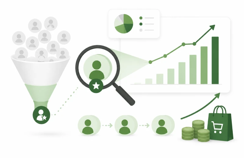
Most Shopify stores generate the majority of their profit from a surprisingly small group of customers. In many cases, the top 20% of customers account for around 80% of total profit. Yet many businesses still treat every customer the same, missing one of the biggest opportunities for sustainable growth.
Instead of identifying who their most valuable customers are, many brands send the same emails, show the same offers, and run the same retargeting ads for everyone. That approach may deliver average results, but it rarely builds a customer base that drives long term profitability.
Identifying your most profitable customers is not about ignoring everyone else. It is about understanding who creates the most value for your business, what brought them to your store, and how to attract more customers like them.
This guide explains how to identify your highest value customers, use the RFM framework to segment them, uncover the acquisition channels that bring them in, and turn those insights into a repeatable growth strategy.
WHAT YOU’LL LEARN

A customer who spent $800 in one transaction and never came back is less valuable than a customer who spent $120 three times in 12 months. The first customer generated more revenue per order. The second customer generated more profit, because there was no acquisition cost on orders two and three, and no return to process.
True customer profitability combines three dimensions:
This is the foundation of RFM analysis.
RFM (Recency, Frequency, Monetary), is the most practical way to rank and segment customers by actual value. It requires no complex modelling: just your order history data.
| Dimension Recency | What It Measures | Why It Matters |
| Recency | Days since last purchase | Recent buyers are more likely to buy again |
| Frequency | Number of purchases (period) | High frequency = loyalty and product fit |
| Monetary | Total spend or avg order | Identifies your highest value buyers |
Score each customer 1–5 on each dimension, combine the scores, and you have a clear hierarchy of customer value. Customers scoring high on all three (5-5-5) are your Champions, the segment to understand deeply and actively replicate.
For Shopify stores, RFM analysis is one of the simplest ways to identify your most valuable customer segments without complex data modelling.
Once you’ve identified your top customer segment, analyse the following customer characteristics:
The answers tell you where to find more customers like them. If your Champions disproportionately came from organic search and converted on a specific product page, that is a signal to invest in SEO for that product. If they came from a referral or a particular Meta campaign creative, scale that channel.
Research from Polar Analytics shows that the top 1% of ecommerce customers can be worth up to 18 times more than the average customer. Identifying and protecting this segment, and understanding what brought them to your store, is one of the highest leverage analytics exercises available to a Shopify founder.

Export your Champion and high value customer list and upload it to Meta and Google Ads as a custom audience. Use this as the seed for lookalike targeting. Customers acquired through lookalike audiences built from high LTV seeds consistently outperform audiences built from all customers.
VIP customers generate 73% higher AOV and complete 3.6x more purchases than standard customers. Give them early access to new products, exclusive offers, and a direct line to your team. The goal is to make sure these customers never have a reason to look at a competitor.
If Champions disproportionately purchased a specific product first, that product is your highest value entry point. Invest in driving more traffic to its page, improve its conversion rate, and feature it more prominently in acquisition campaigns.
Champions Customers who have all the hallmarks of Champions but haven’t purchased recently are your highest probability win back targets. A personalised email acknowledging their absence, with a specific, product relevant offer rather than a generic discount, typically converts at 15–25% for this segment.
Avoid Treating Every Customer the Same
Brands that send identical email campaigns to all segments consistently underperform those that segment by RFM. A win back campaign sent to a Champion is very different from the right message for a one time buyer. Treating all customers identically is the single most common retention mistake in ecommerce.
Your most profitable customers are already in your data. Most brands just haven’t looked. Running a basic RFM analysis takes a few hours with your order history data, and the insights it surfaces will change how you think about acquisition targeting, email marketing, and product strategy simultaneously. Understanding who your best customers are is nice to have. It is the analytical foundation for building a brand that compounds rather than churns.
Customer analytics goes beyond average LTV. The insight is in the segments, which customers are truly driving your growth, where they came from, and what keeps them coming back.
DataAnalyticsStack helps ecommerce brands identify their highest value customers, track customer lifetime value, and understand which acquisition channels drive long term growth.